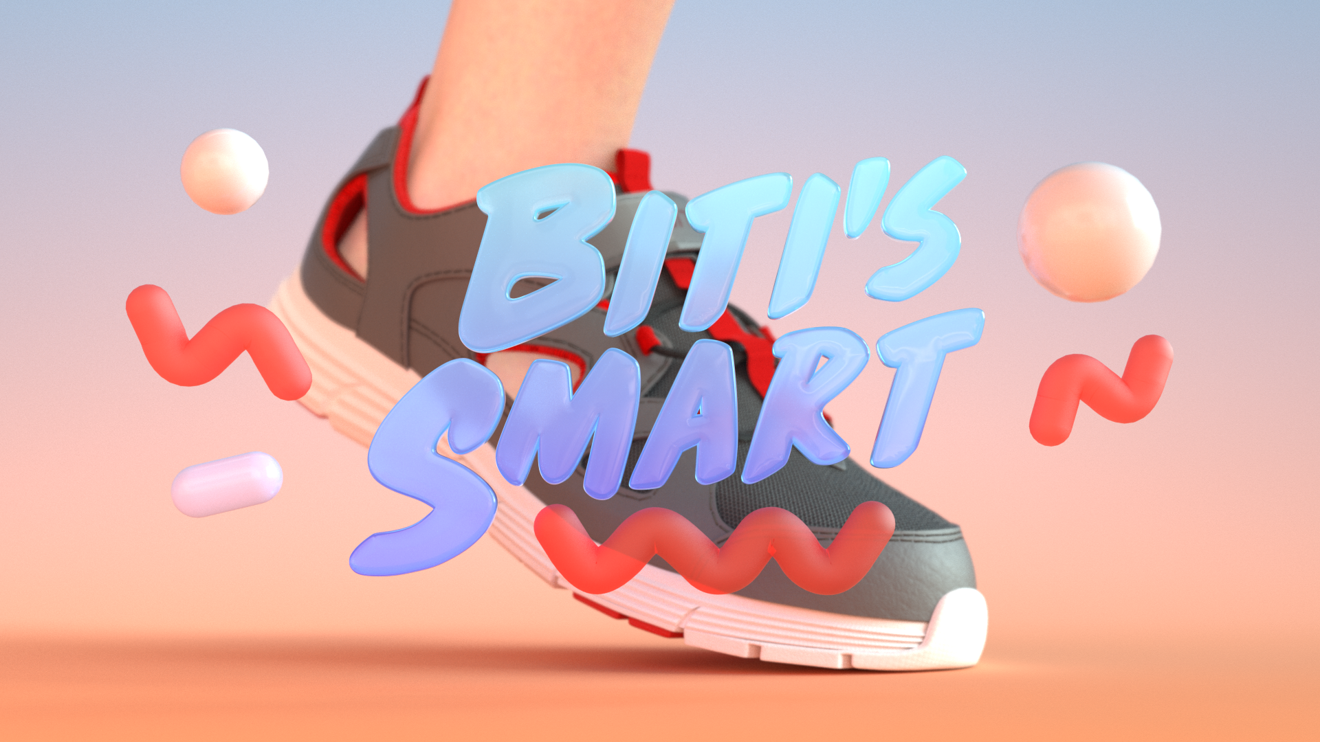
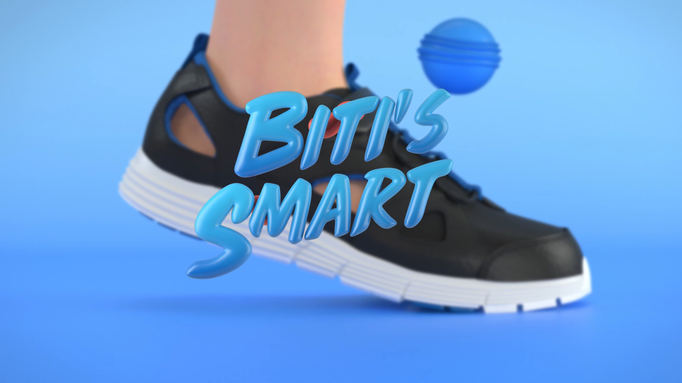
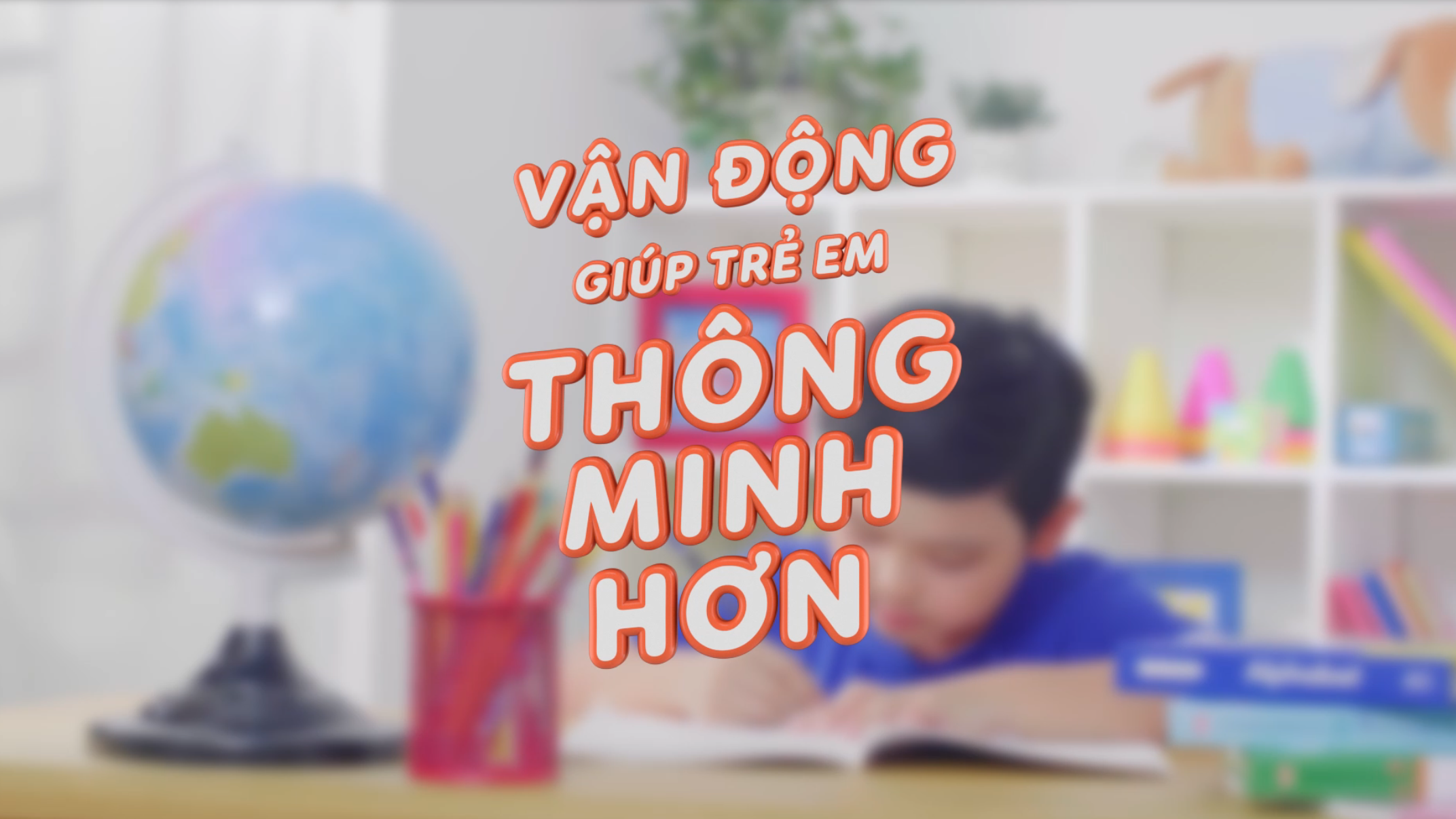
Have you ever heard about the scientific fact that activities make kids smarter? Biti's Smart is an ambitious project of Biti's to help kids grow smarter through physical exercises. In order to achieve that, Biti's Kid creates a range of shoes with 3 main purposes:
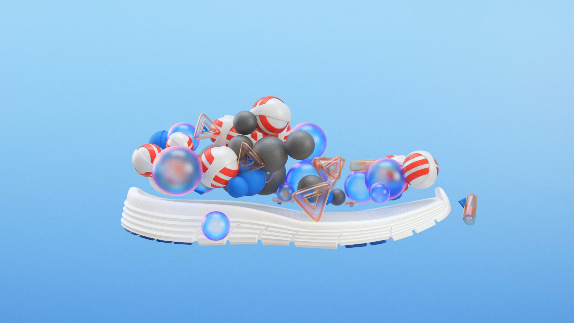
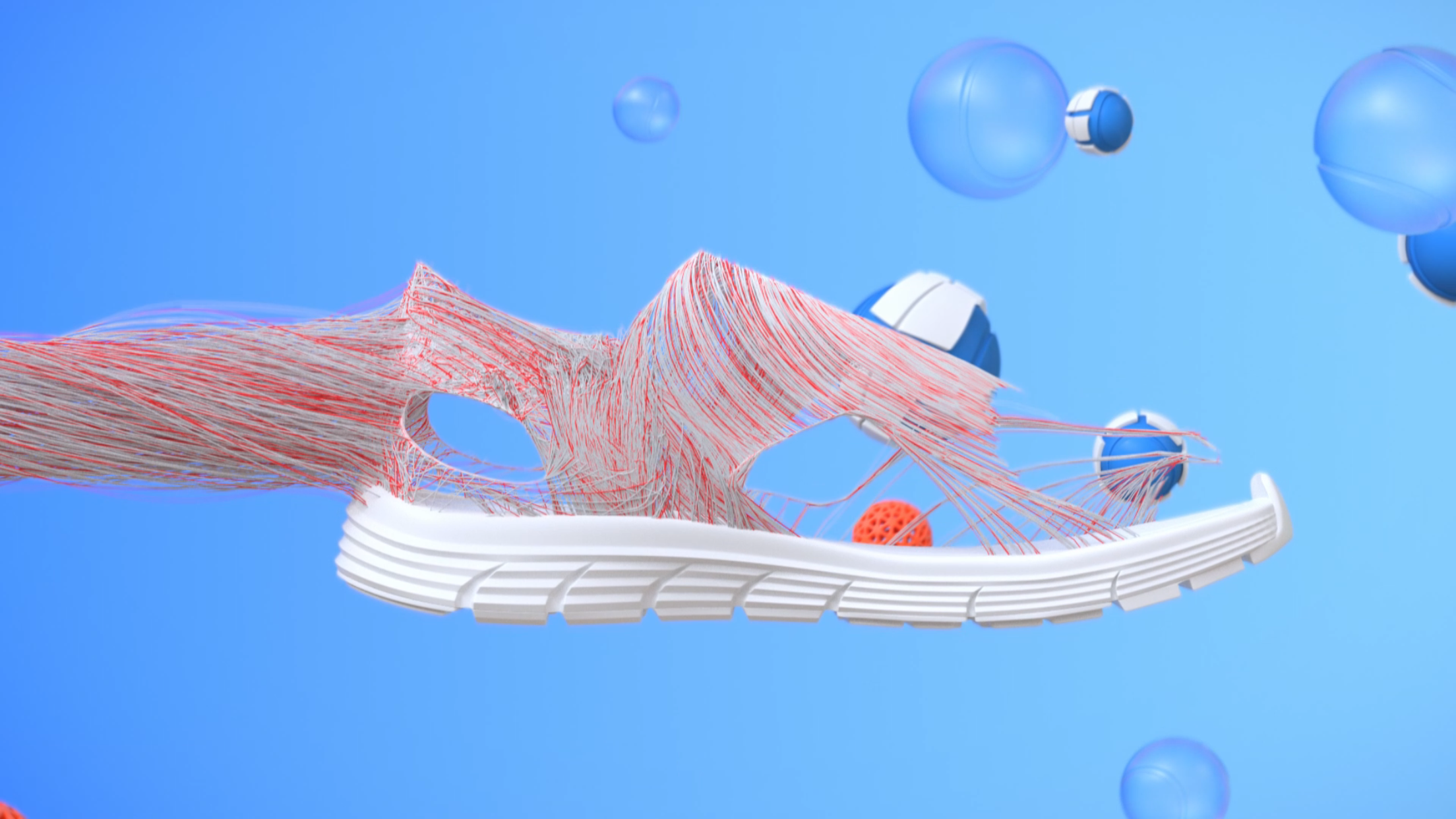
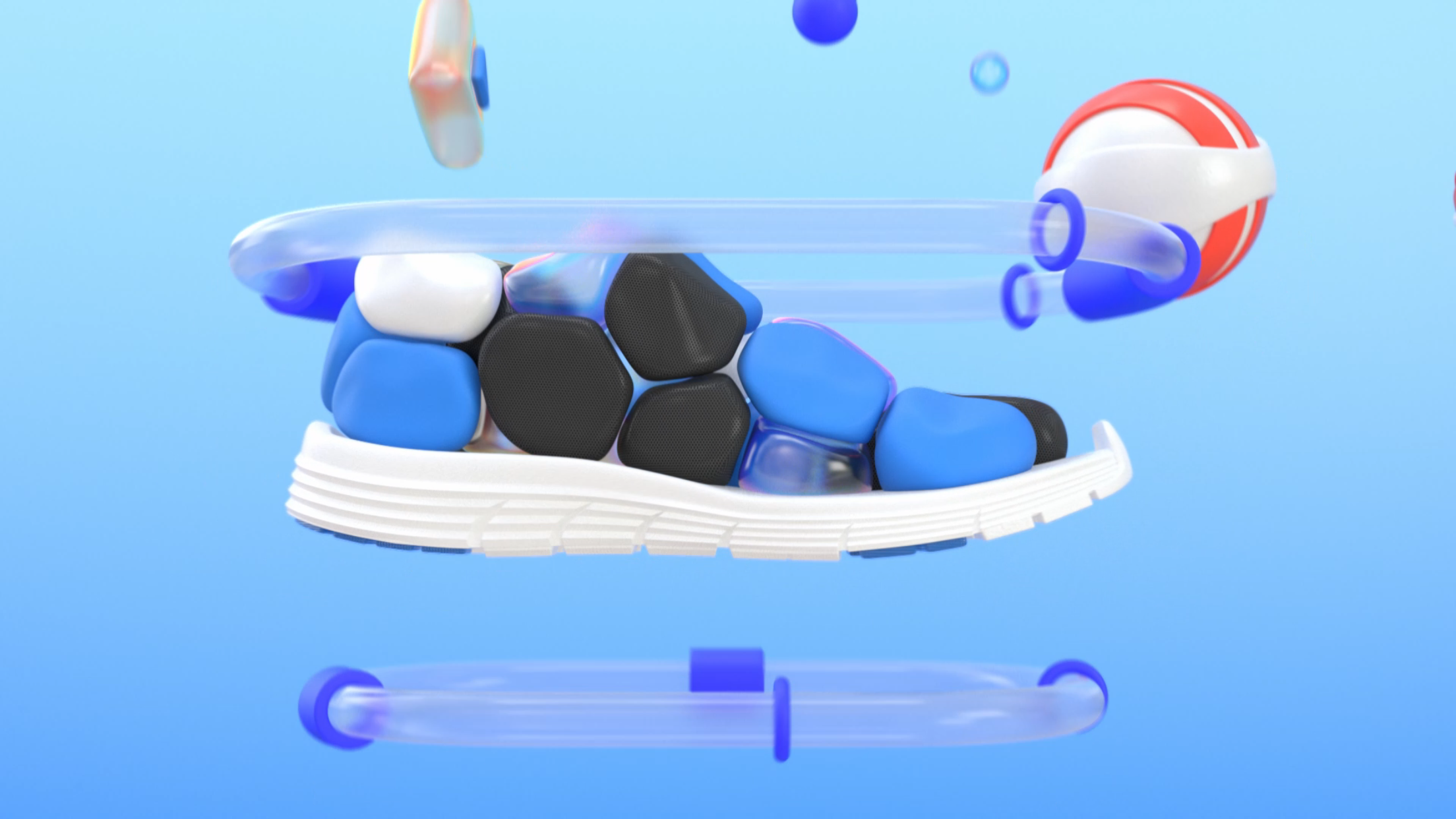
Comfort: Shoes are designed with the latest technologies such as Phylon, EVA and Airmesh to make kids comfortable while wearing. As a result, shoes are softer, lighter and more comfortable.
Smart: Inside every pair of shoes, there are chips designed to track kids’ activities. These chips are connected with Biti's Smart app so parents can review all the physical data and suggest to them the best activities for their children.
Together with IPD, Biti's wants to study and research the activity benchmark for Vietnamese kids.
Our scope of work: Create a story to inspire audiences of the latest Biti's Kid's product.
Client: Biti's Kid
Agency: Redder, Red Cat Motion
Director: Leo DINH, Hoang Anh
3D Production: Freaky Motion
Live Production: Draco Film
Sound Designer: Luke Brown
How did we make this?
The project was very inspiring and so challenging. We only got the right outcome until the last minute. From the beginning, this project was strictly confidential because it would become a game-changer. Our Director Leo DINH had to work on the concept alone himself without letting anybody knew.
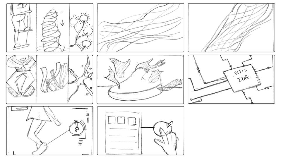
Storyboard
The brief was very simple in the beginning. We only knew that the client was making the product while briefing. They also provided lots of facts and inspiration sources to us. Based on that, we had to think of the story concept and propose it to the client. In the proposal, the storyboard was drawn very roughly to catch the ideas
Moodboard
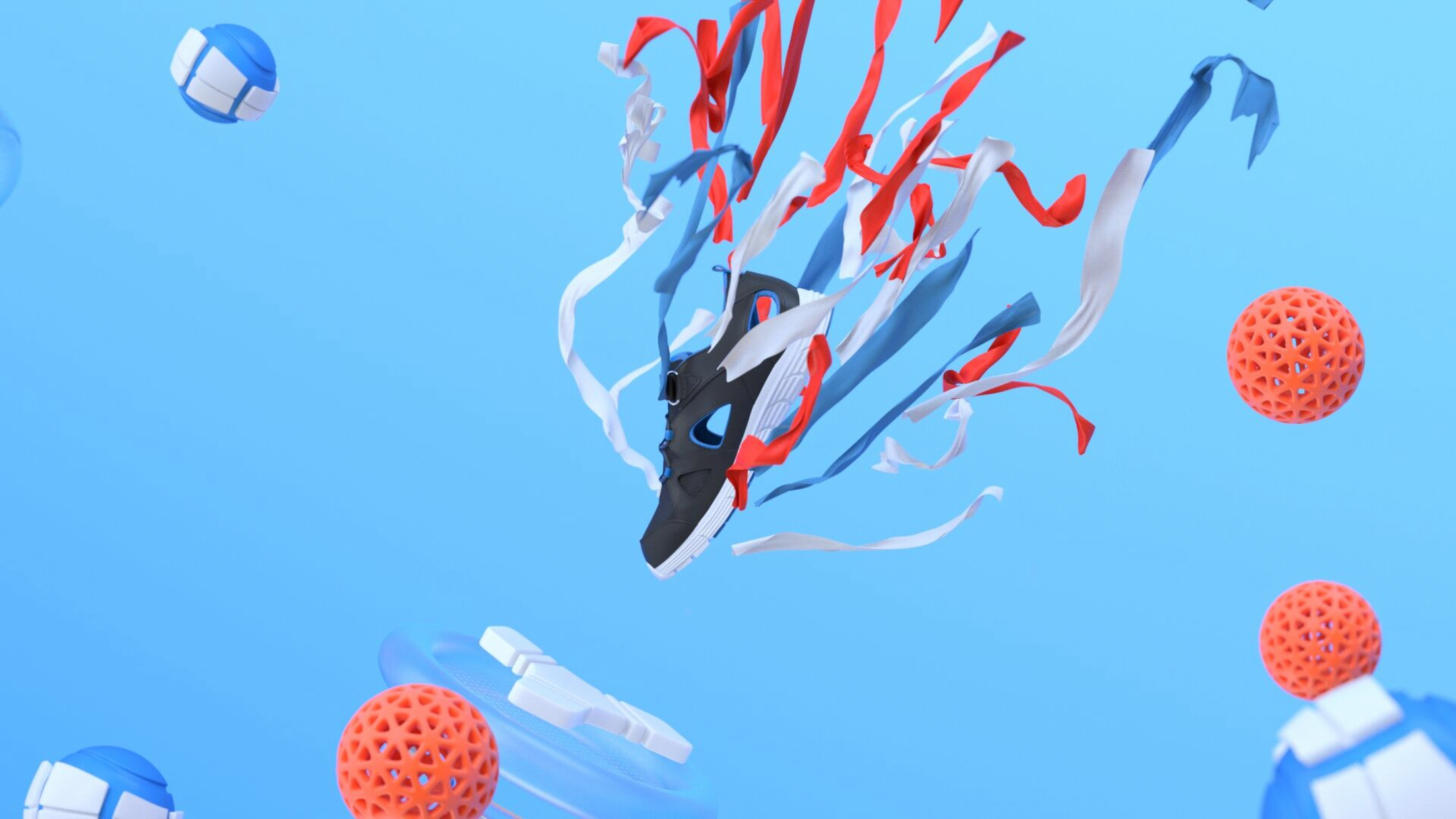
Our director wanted to combine live-action with 3D animation. This was a challenging approach as we only had less than 6 weeks to produce the film. We wanted to achieve a kiddy, bright, colorful, and hi-tech look.
Look Development
All the 3D animation was executed by the great team at Freaky Motion. Hoang Anh was in charge of animation direction. This task was never easy to get the right look and feel, especially since Biti's did not have a clear branding guideline as they were building them.
First Attempt
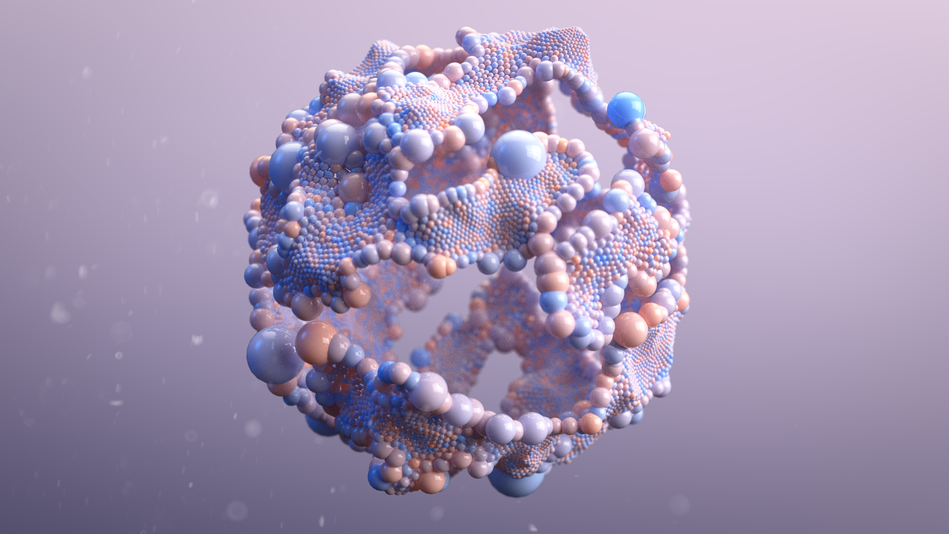
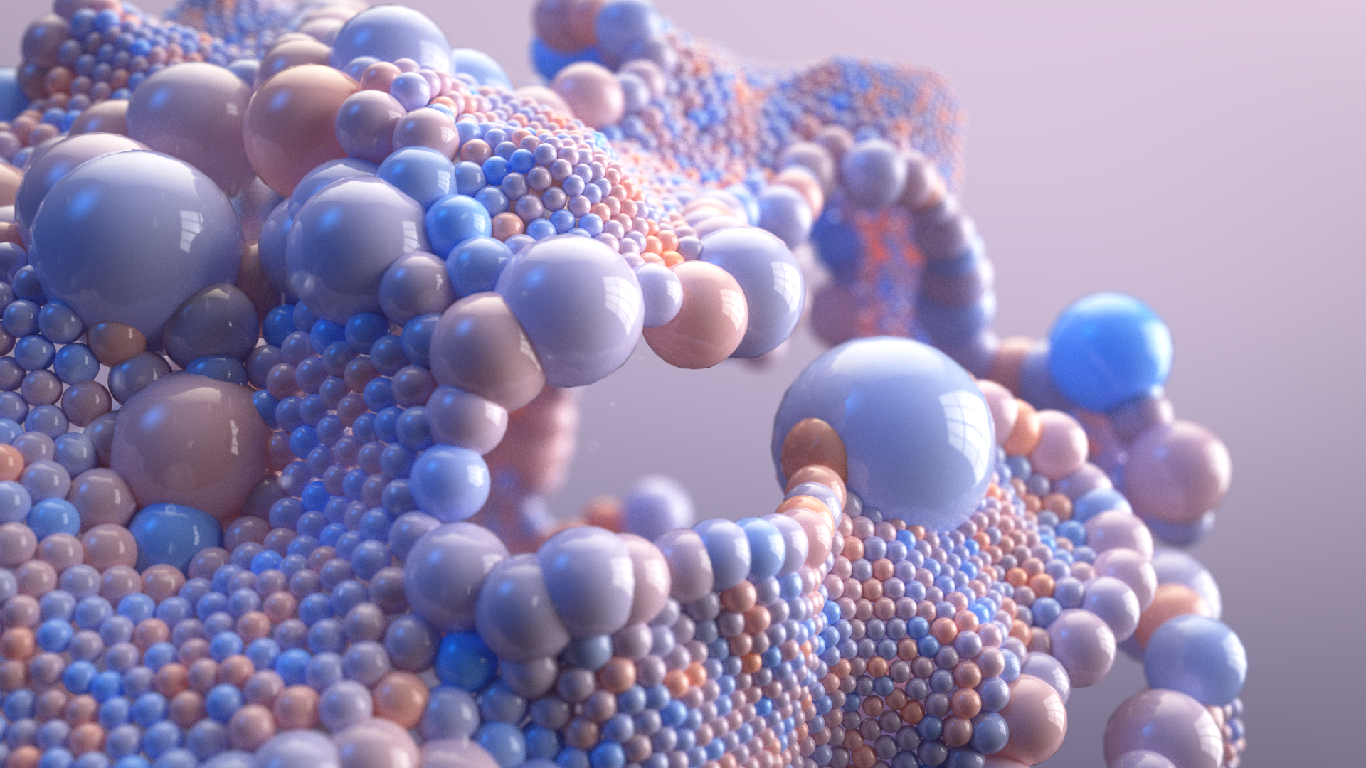
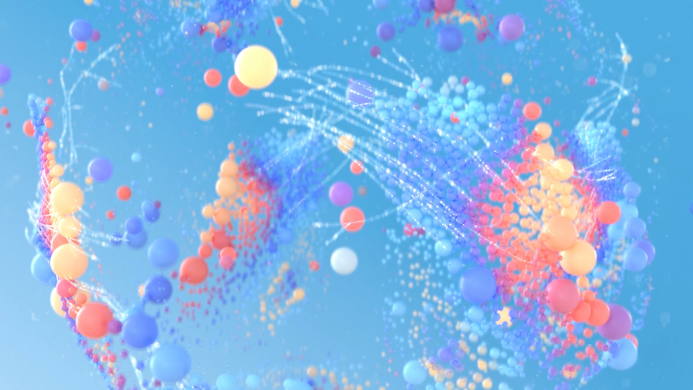
The video talked about brain growth, but our director didn't want to show a real brain, or too scientific images so he briefed Hoang Anh to use spheres and connected them in a pattern. The first approach impressed the client but all the images didn't connect to the brand very well, especially the colours.
Second Attempt
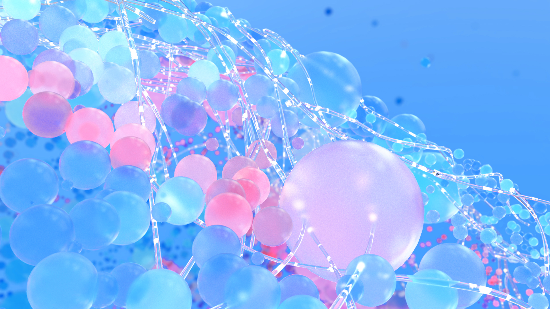
We met the client and agreed to keep the video colorful but add more red and blue to every single image. When you looked at one single image, it looked fine but they didn't connect very well as a video.
3 split screens stood for different functions of the shoes.
Styleframe for the brain part.
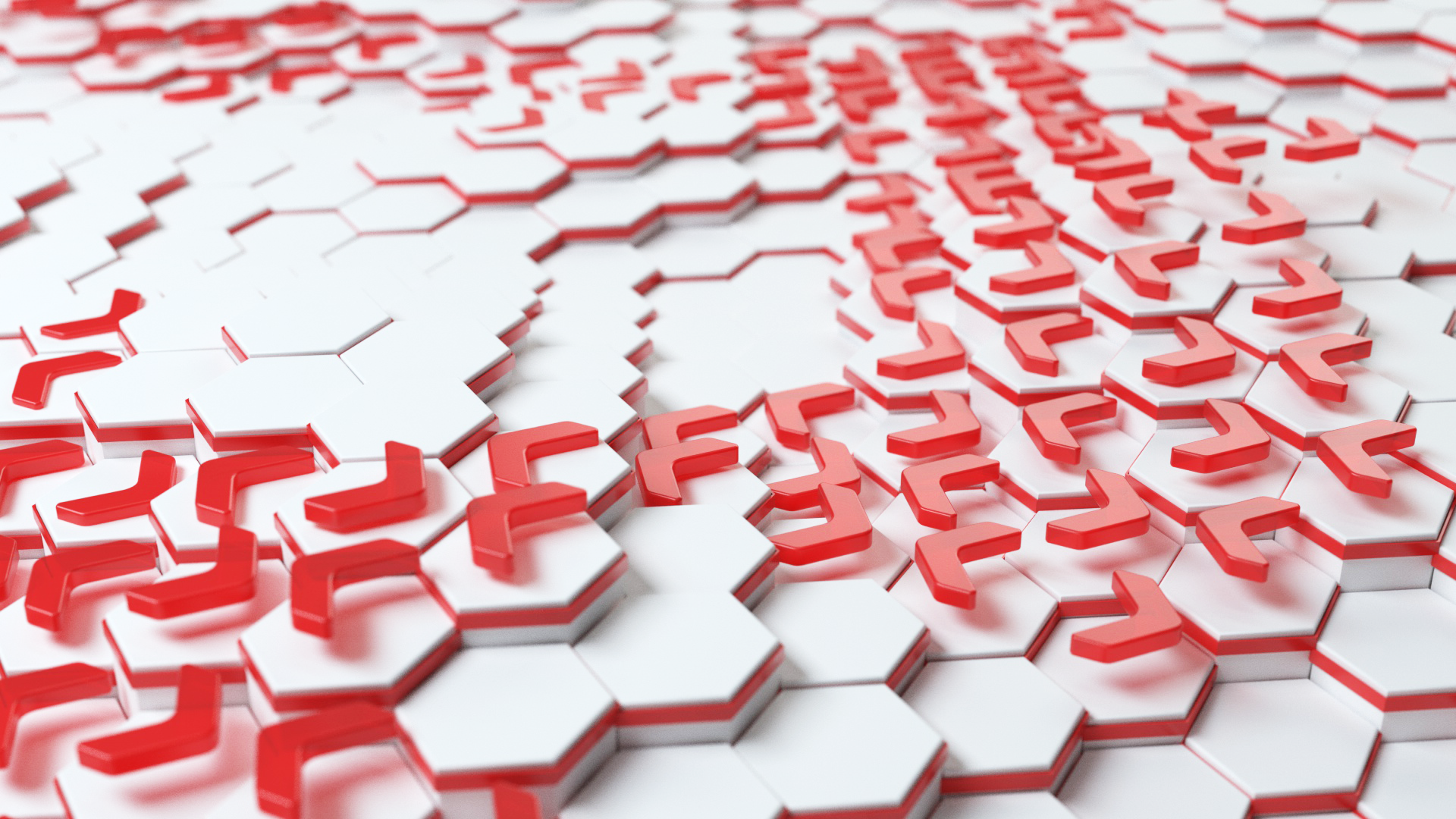
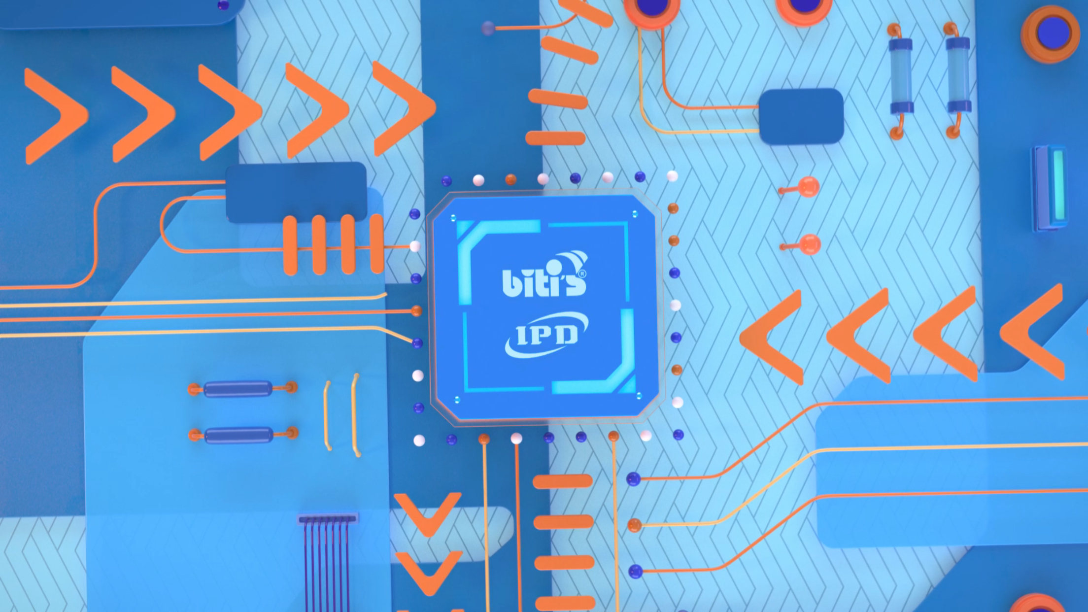
The design of the chip pattern inside the shoes.
Third Attempt
After working on many options, we discussed with the client and convinced them to use blue as the key colour and other colors like red, orange, yellow were secondary only. The final result was very pleasing. It worked very well with the brand and connected everything seamlessly.
HUD Design
We featured HUD in the video to share an idea of parents can track their kids' activities on a mobile platform. The first design brought the hi-tech feeling but didn't fit our theme. As a result, we revised and used the second design as a reference for all the HUD designs.
First Draft
If you look at the first draft, you will see that there is a big improvement on the latest version. Finally, we did it.


